
YOLO by Sonai:
A packaging redesign, restaurant branding and social media case study by Creative Garage.
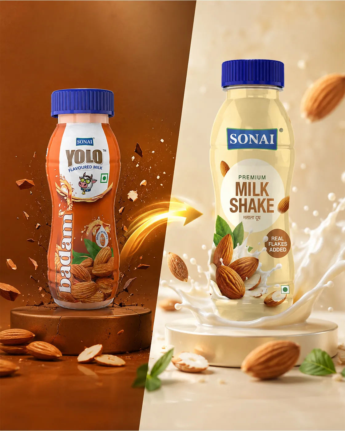
Before we redesigned YOLO, the brand already knew how to get noticed. It was bright, playful and unapologetically youthful. YOLO was written boldly across the bottle. Badam ran vertically down the pack. A sunglasses-wearing cow brought humour and personality to every flavour. The orange label carried splashes, ingredients, badges and energy cues—all working together to make the product feel fun and ready to go. It was a brand created for movement. Grab it. Sip it. Get going.
The earlier YOLO identity had been built as an on-the-go flavoured milk range, with a central cow mascot and a different illustrated treatment for every flavour. It had youthfulness, recognition and a clear sense of fun. But brands, like audiences, grow. And as Sonai's ambitions for the range became bigger, the packaging needed to do more than attract attention. It needed to create desire.
The magic was not one design element. It was a series of carefully connected decisions.
The older system created consistency by repeating a recognisable layout, mascot and flavour structure.
The new system creates consistency through a shared philosophy: Every flavour deserves its own world.
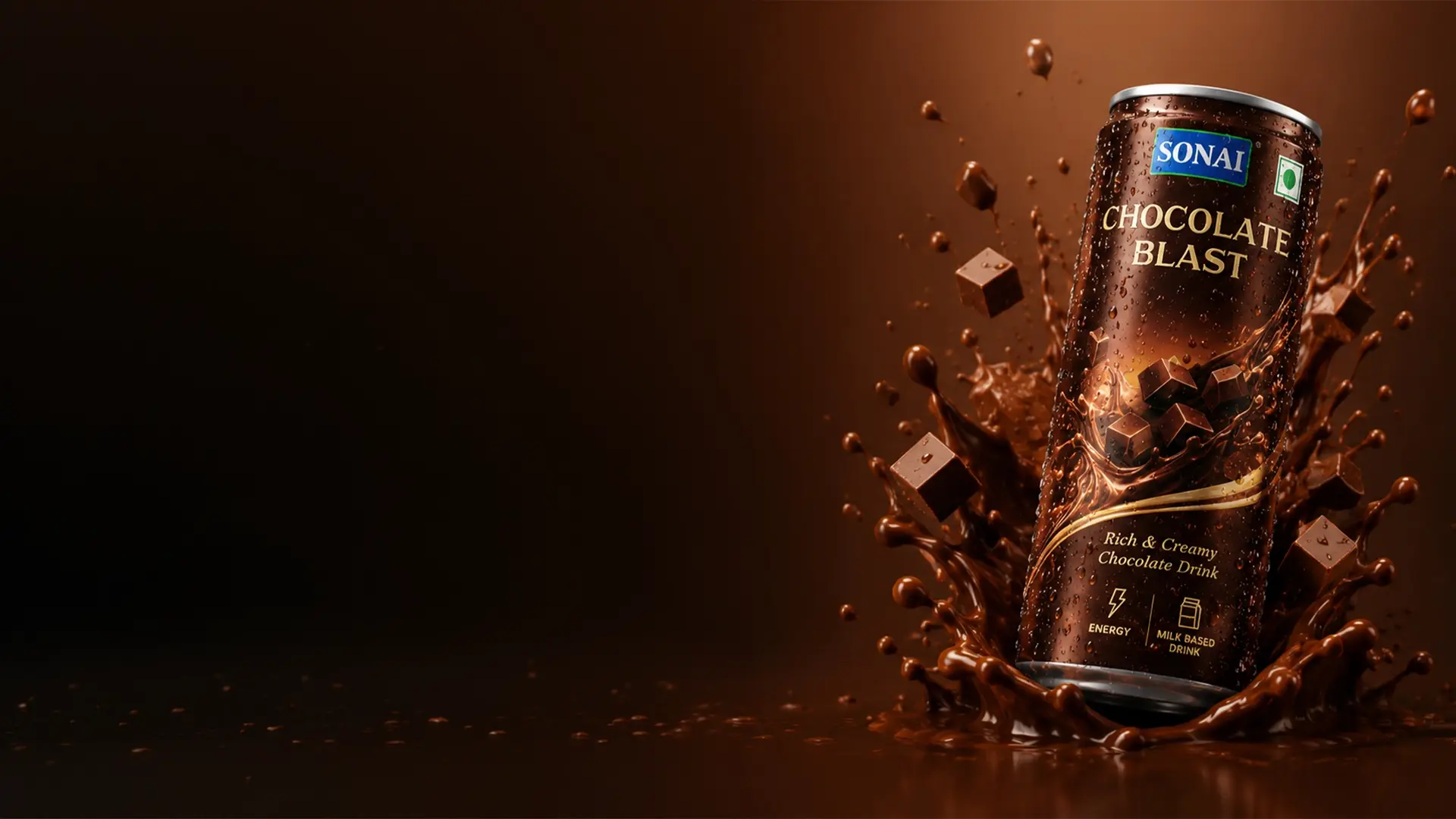
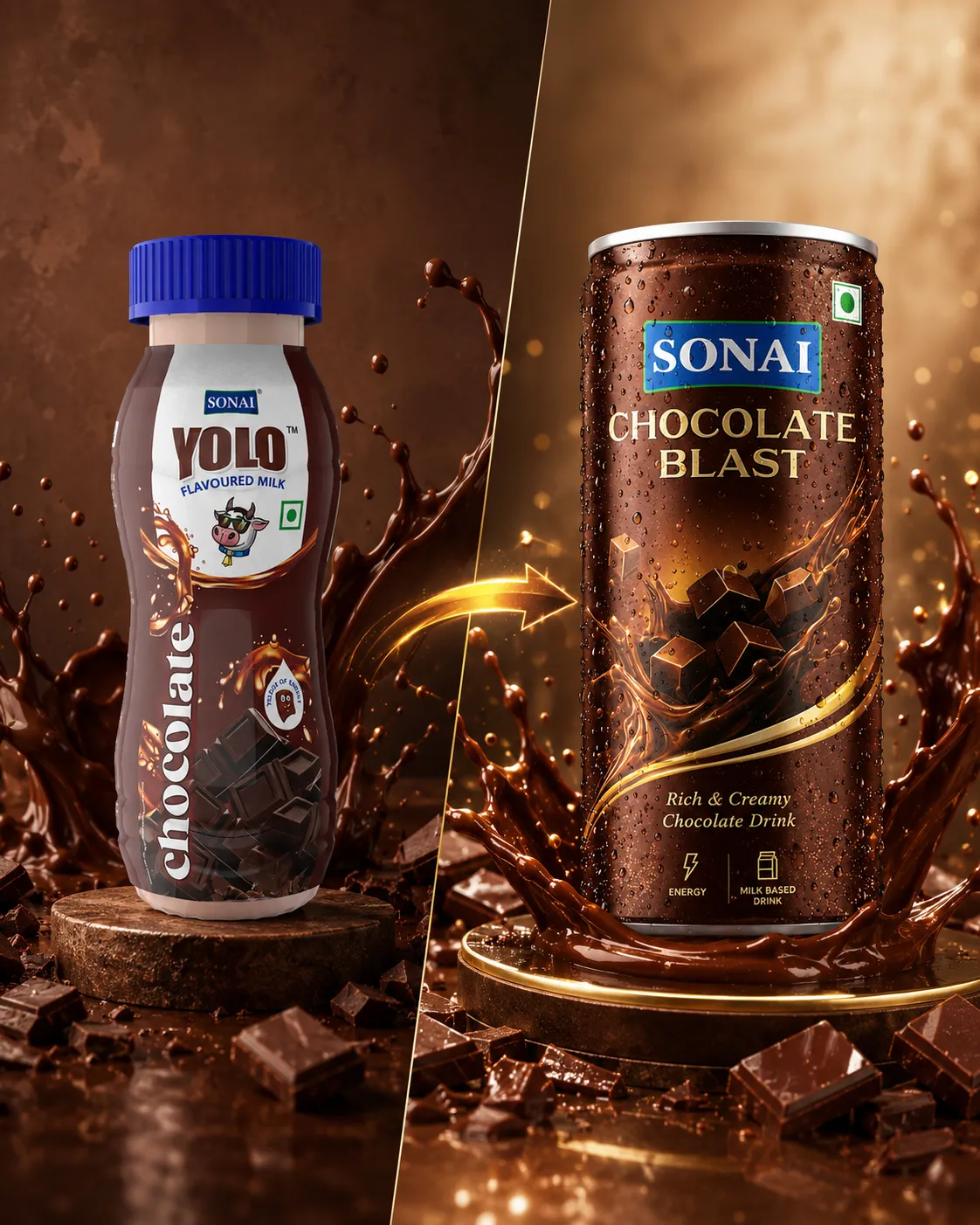
Chocolate does not need to be explained. It needs to be desired. That became the starting point for Chocolate Blast.
The deep brown palette gives the pack richness and depth. Chocolate cubes emerge from flowing liquid. The movement feels energetic, almost as though the flavour has burst across the can. That visual energy gives meaning to the word "Blast".
The chilled metallic can, droplets of condensation and the smooth movement of the liquid make the product feel cold, immediate and ready to drink.
The new pack makes them imagine the first cold, creamy sip.
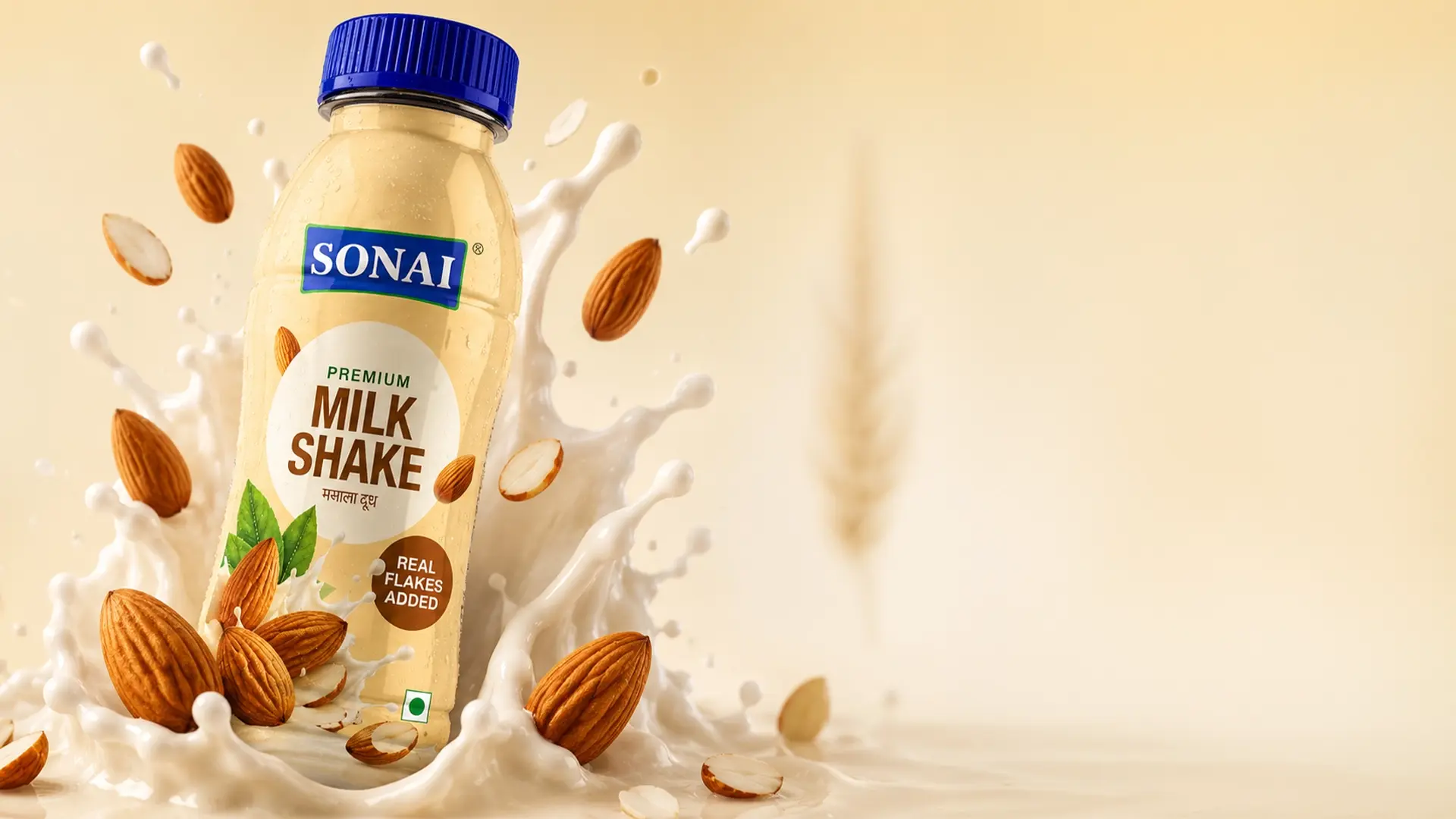
Badam brought an entirely different challenge. We wanted to protect the trust surrounding badam while giving it a more desirable, contemporary expression.
Real almonds become central to the visual story. The milk splash adds freshness, movement and creaminess. The new design allows the ingredient and the flavour to take the lead.
A soft golden environment creates a sense of richness.
It invites them to choose it because it looks delicious—and then reassures them with the goodness of real almonds.
Chocolate and badam do not feel the same. They should not be forced into the same visual expression.
Each flavour lives in its own world, yet the family resemblance is unmistakable.
Distinct in emotion. Unified in philosophy.
The new identity flows into advertising and restaurant experience across every touchpoint.
YOLO is no longer just a pack. It is a brand people see, feel and choose.
Today, many consumers discover a beverage on a phone before they discover it in a refrigerator. That meant YOLO's social media could not be treated as an afterthought.
The older public-facing communication frequently positioned YOLO around flavour variety, refreshment, energy and spontaneous enjoyment.
The new identity gave us the opportunity to take that communication further. Instead of placing the pack inside generic social media templates, we extended the world of every flavour into the content.
For Chocolate Blast, the feed could become darker, bolder and more indulgent—filled with flowing chocolate, cold cans, dramatic close-ups and craving-led communication.
For Premium Badam Drink, the content could become warmer and more ingredient-led—using almonds, creamy textures, golden light and everyday moments of nourishment.
The pack remained the hero. But the world around it could keep changing.
Packaging has limited space. Social media does not. It allowed YOLO to give every flavour a voice, a mood and a role in the consumer's life.
YOLO behaves differently depending on where people encounter it.
the packaging has seconds to create desire.
the brand has to stop the scroll and begin a conversation.
it must turn visual recognition into an experience people remember.
The medium changes. The emotional idea does not.
The packaging creates craving. The social media creatives give that craving a daily voice.
The restaurant turns it into a physical world.
These were not three separate design projects. They were three chapters of the same brand story.
The earlier YOLO identity was playful, energetic and character-led. The new identity is sensory, flavour-led and experience-ready. It retains the spirit of enjoyment that made YOLO relevant to a younger audience, but expresses it with greater depth, appetite appeal and flexibility.
Creative Garage did not simply make the packaging more premium. We created a system in which:
That is the difference between redesigning a pack and building a brand.
Building a food or beverage brand that needs to travel from shelf to screen? Creative Garage brings together brand strategy, packaging design, restaurant branding and social media communication to create one memorable consumer experience.
YOLO by Sonai — From a Flavoured Milk Pack to a Complete Brand World
